
Page 86 - text
P. 86
SeCtion tWo Change approaches & management tools
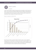
PARETO CHARTS Description
A type of chart that helps to identify the key issues that cause negative or positive impacts on a service. The number and/or percentage of different factors are mapped on a graph and put in order of frequency with the most common on the left. Those that contribute to the first 80% of an impact are seen as the most important (‘the vital few’) with those which contribute to the remaining 20% seen as relatively unimportant (‘the trivial many’).
Figure: An example of a Pareto chart
25 20 15 10
5
100
90
80
70
60
50
40
30
20
10
Pareto Chart
The purpose of the chart is to show the relative importance of each of a list of categories/ factors in relation to the specified unit of measure. In the context of improving quality, it is used to highlight the most common errors, the most frequent types of customer complaints, or the most complained about product or service etc. Effort is concentrated on solving the problems with the most frequent occurrence (towards the left hand of the distribution).
83
Number of times included in complaint
Percentage
Poor communication from team Support package not sufficient
Poor quality of care
Not joined up with health
Charge too great Different worker each time
Worker not polite
Did not listen to us
Cat died in cattery
